
Apple Passwords App
Managing passwords is difficult when you have a million passwords
Are you doing enough to protect yourself from hackers?
Passwords are essential for securing your online accounts, but their commonality can lead to forgetfulness, risking access to your personal information. Cyber criminals often target passwords to steal files, money, and commit identity theft, making it crucial to prioritize password security to mitigate these risks.
Role
UI Designer
Skills
User Research
Interaction Design
Visual Design
Tools
Figma
Pen & Paper
Procreate
Timeline
September — October 2024
Team
Aaron Tang, Miles Angelo, Sophia Lee
Overview
This project reimagines Apple’s Passwords app to help users quickly identify and update compromised passwords. By prioritizing clarity, efficiency, and trust, the redesign encourages proactive security behaviors while reducing the time and effort required to manage passwords.
Outcome
The bulk change feature reducing the average time for password updates to under three minutes. User satisfaction scores improved, reflecting a more efficient process and increased user trust in managing their password security. Feedback indicated that users felt more empowered to proactively secure their accounts, enhancing the overall effectiveness of the app.
Project Objectives
To improve user trust, security awareness, and efficiency within Apple’s Passwords app. Aiming to reduce friction when updating compromised passwords and make security risks more visible and actionable. Another objective was to better align the experience with user expectations and Apple’s human interface guidelines.
Problem
Password security is often overlooked, posing a risk to Apple users
In 2022, over 24 billion passwords were exposed by hackers. More than 80% of confirmed breaches were stolen due to weak, or reused passwords. Nearly 60% of individuals make their passwords stronger after noticing unauthorized access to their accounts or devices. People often take action only when it’s already too late.
Sources: Digital Shadows, LastPass, Norton
UI Design
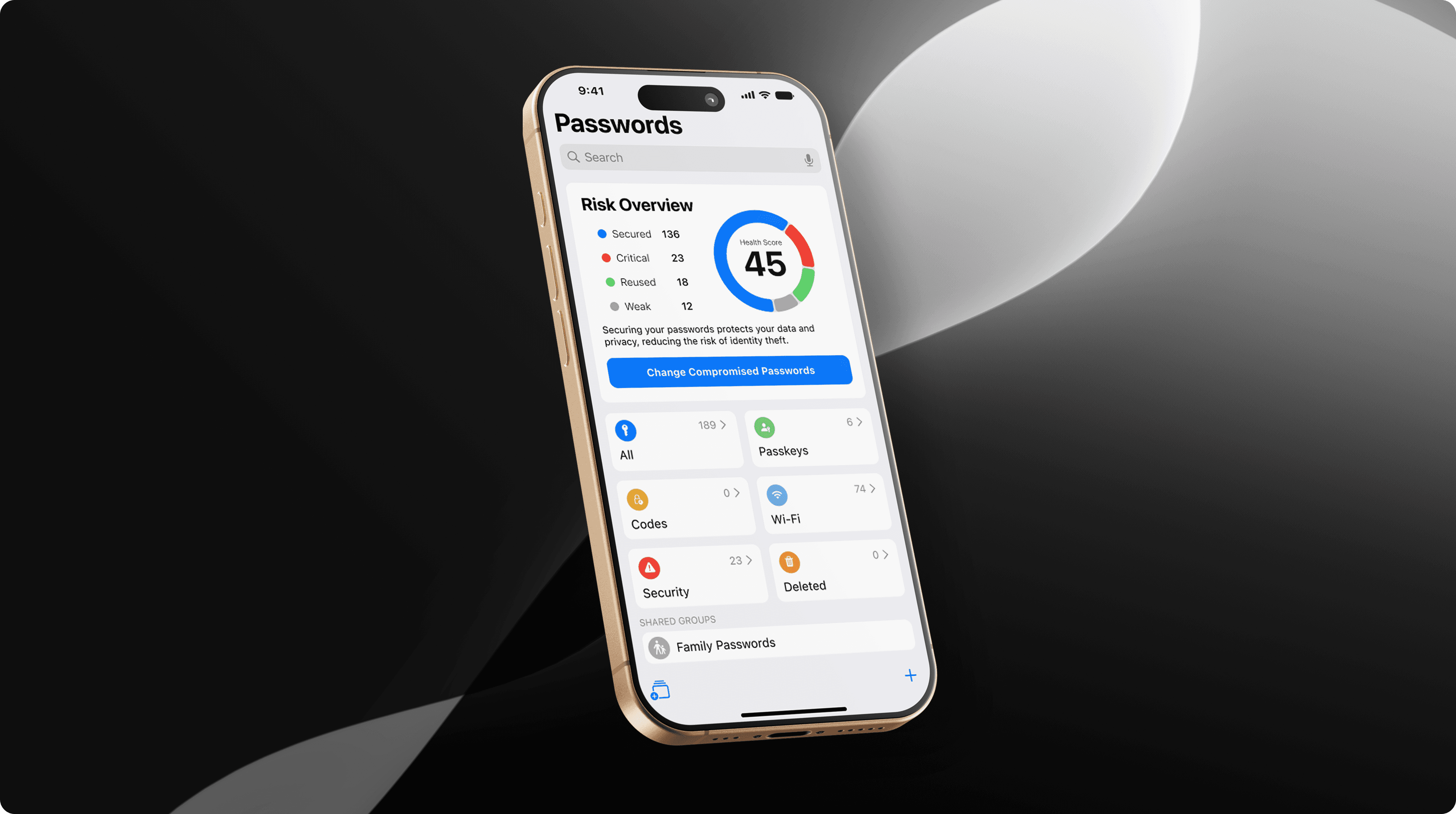
Quickly updates compromised passwords
We added a new feature that allows users to quickly update multiple passwords. The new app provides users with urgent information about their security at a glance when they open the app.
The new feature allows iOS users to change all of their compromised, weak and reused passwords within minutes rather than individually. Now users can take a more proactive approach to their security and protection.
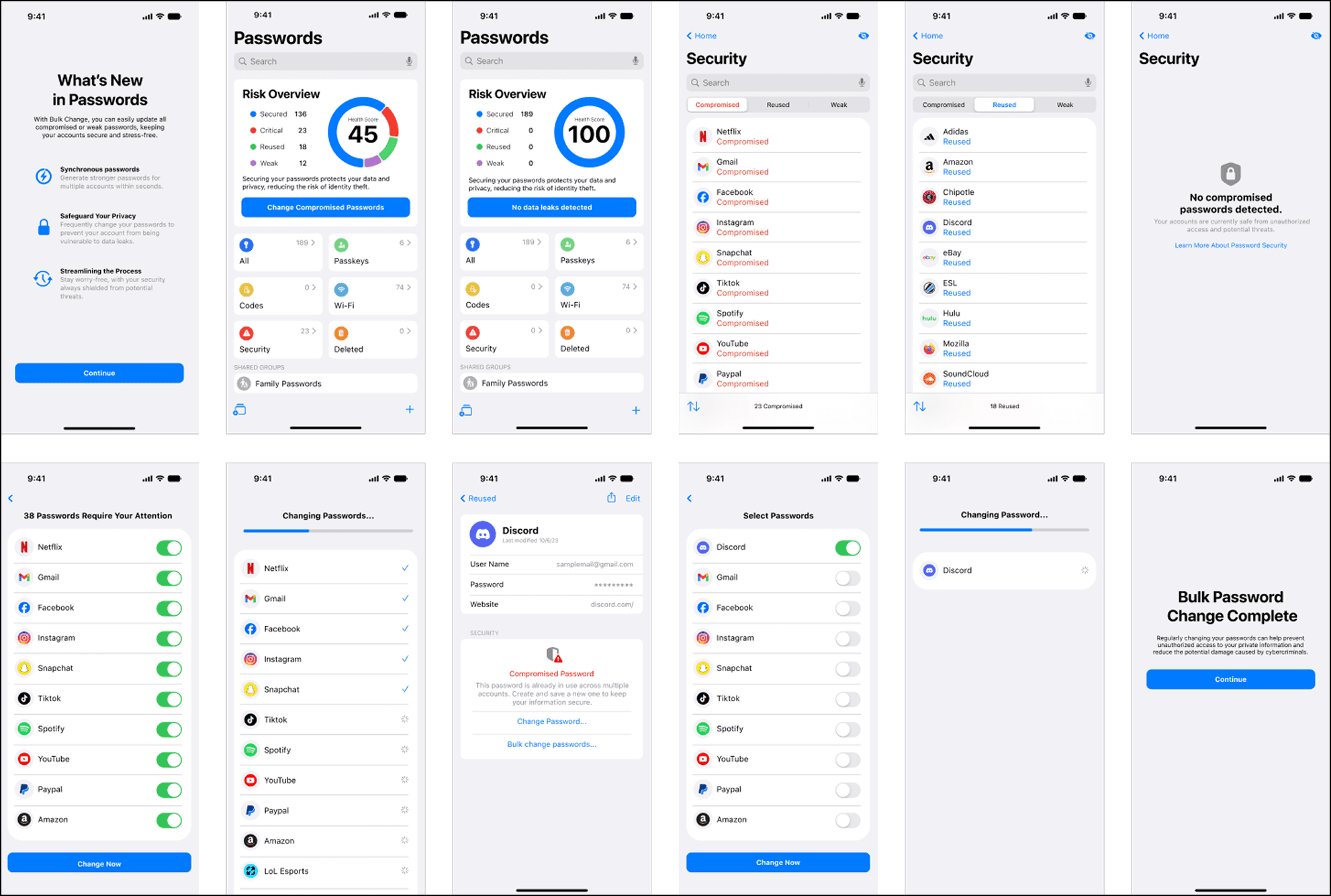
Bulk Change Feature
With Apple, you can take action right away if any of your information is exposed to cyber threats.

Updated security page enables users to easily filter through passwords.
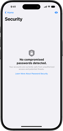
This feature visually highlights potentially at-risk passwords for better clarity.

Users can easily select which passwords to exclude from the bulk change.

Quickly resolve compromised of passwords.

Adds awareness if your passwords are reused or not
Whether you get an email from a company or you’ve entered your email into a dark web monitoring tool, discovering you were a part of a breach is frightening. Breaches can place all your private data at risk, which can lead to identity theft and more.
You’ll never have to worry about your passwords being compromised due to bad password practices since Apple always generates strong, unique passwords for each of your accounts.
Research
Interviews revealed multiple pain points
We conducted an cognitive walkthrough to understand user’s feelings and behaviors towards the current state of the app. They assessed 7 different screens with 8+ users expressing that the app felt barebones and too simplistic.
Overall, the walkthrough did not provide users with any inherent value in regards to user safety and security, leading them to doubt its effectiveness compared to alternative solutions.


Users struggled with determining which password should be changed first. The process of changing passwords for each account is different. Furthermore, they are not encouraged to change their passwords frequently, and creating strong passwords can be challenging to enter/remember.
Brainstorming Features
During this phase of discovery, we focused on exploring a wide variety of approaches with a focus on creating trust.
Assessing Ideas
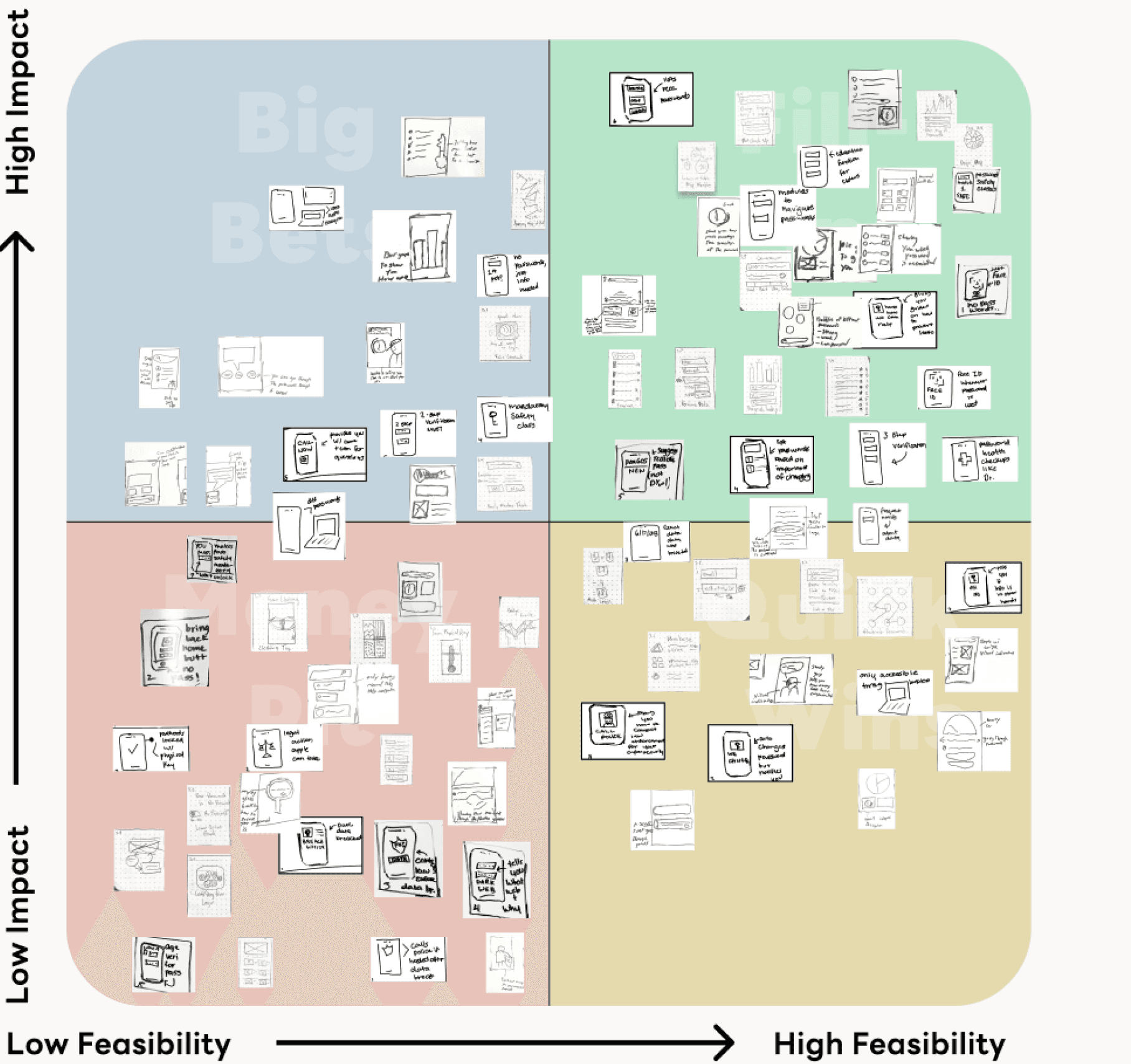
Our team sorted each idea into a matrix to prioritize ideas to help decide which ideas are worth moving forward. Ideas scanned for any duplicates and were organized based on how feasible they were to implement and their potential benefits for users.
Crazy Eights Rapid Ideation

I rapidly generated over 70+ ideas using the Crazy Eight brainstorming method, a rapid sketching exercise. Each sketch was limited to 45s before ideating another concept.
While not every idea was worth exploring, it allowed ideas to push beyond any initial bias to find deeper solutions. Several ideas that can be refined is better than perfecting one idea immediately.
Prototyping
Several low fidelity prototypes were sketched initially then refined for further testing
We developed prototypes to explore of these ideas further, using Figma for detailed layouts and Marvel to add interactivity. Enabling users to have a more hands-on testing experience, resulting in more accurate feedback.
1.1
1.2
1.3
1.4
1.5
1.6
1.7

First Low-Fidelity Low Resolution Wireframes
2.1
2.2
2.3
2.4
2.5
2.6
2.7

Mid-Fidelity High-Resolution Wireframes
User Testing
Capturing customer insights by surveying users on satisfaction and usability.
Receiving feedback is critical to ideation process. Gathering both quantitative and qualitative feedback will guide the decision making on what parts of the app needs improvement.
I wrote down a testing card and several learning cards after facilitating a small workshop with 5 users on the experience with the app prototype.
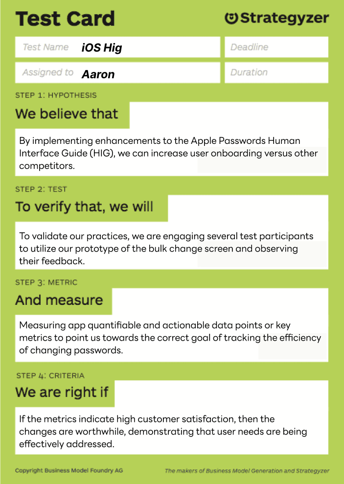
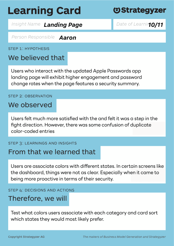
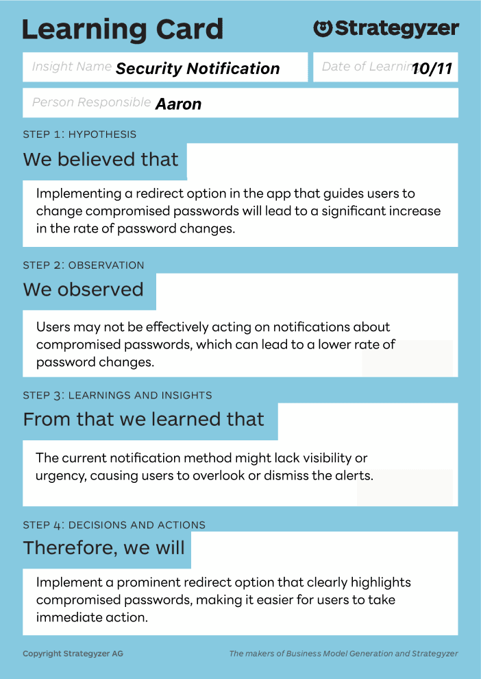
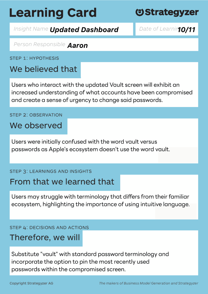
Strategyzer Testing and Learning Cards
Insights revealed highlights several areas
of improvement
After facilitating user testing sessions with four participants, I was able to uncover key insights into how people interact with the bulk password change feature.
Observing their behaviors and listening to their feedback revealed both usability strengths and areas that caused hesitation or confusion. These sessions helped invalidated some of my design choices and made rethink the UI.
Some Key Takeaways
User 1
The user found the overall flow intuitive and easy to navigate without much guidance.
However, the red hazard symbols felt overly intense, creating unnecessary anxiety during the process.
They responded positively to the security summary at the end, noting that it provided a clear and reassuring sense of completion.
User 3
The user struggled to differentiate between reused and compromised passwords, indicating a need for clearer visual or textual distinctions.
They showed interest in having access to previous password entries, suggesting this would improve transparency and trust.
They also preferred a progress bar over a loading spinner, as it would better communicate how far along the process is.
User 2
The user was unclear about how overall password health was calculated, which made it harder to fully trust the system’s evaluation.
Initially expressed concern about their password data being stored, highlighting a need for stronger communication around privacy and security.
They also felt that some parts of the interface lacked depth, wanting more detailed explanations behind certain security labels and feedback.
User 4
The user initially hesitated at the bulk password change step, unsure of what actions would be applied automatically versus what required manual confirmation.
They found the feature powerful but slightly overwhelming, suggesting that breaking the process into smaller, guided steps would make it feel more manageable.
They also expressed a desire for clearer reassurance around data privacy, specifically how their credentials are handled during the update process.
Project Takeaways
Working on this project taught me how essential it is to balance strong security with an experience that feels approachable and trustworthy. Through user testing, I saw firsthand how visual cues and messaging influence user confidence. What feels secure to designers can sometimes feel intimidating or unclear to real users. Even small design choices, like icon styles or phrasing, can shape trust.
This process deepened my understanding of designing for security without adding friction. It is not only about protecting information but also about helping users feel in control and informed every step of the way. Going forward, I will focus more on communicating clarity and reassurance through design, especially in products that handle sensitive data.

